How to choose a painting for the interior?
20.10.2020
How to choose a painting for the interior?
Date of last update:
20.10.2020
Do you want to update the interior or decorate a new house, but the variety of paintings scatters your eyes? We have compiled a few unspoken rules that will make it easier to choose the "right" piece of art.
1. Classic or abstract art?
Both of them can be placed in the interiors of different styles. We appreciate the idea that art should be chosen for the soul. If the painting does not perfectly match the colors and plot for the design project, but pleases and inspires, feel free to choose it. The privilege of our time is the ability to combine the incongruous. Classic portraits or landscapes will add interest to modern interiors. Abstraction will add a little audacity to the classics. Your imagination can be free!
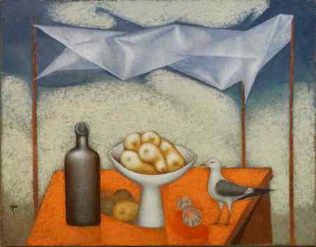
Don't want to destroy the harmony of space? You can repeat the style of the interior in the paintings. Then a classic still life, for example, will not suit a boho-style interior that loves ornament and bright colors. The seascapes of Dmitry Balakhonov, the views of St. Petersburg by Alexei Stenyaev, and Evgeny Terekhov will look integral with the classical decoration. Their paintings can be bought on our website or at RakovGallery in St. Petersburg.
Don't want to destroy the harmony of space? You can repeat the style of the interior in the paintings. Then a classic still life, for example, will not suit a boho-style interior that loves ornament and bright colors. The seascapes of Dmitry Balakhonov, the views of St. Petersburg by Alexei Stenyaev, and Evgeny Terekhov will look integral with the classical decoration. Their paintings can be bought on our website or at RakovGallery in St. Petersburg.
2. The painting`s purpose
Should it attract all attention to itself or be an object harmoniously inscribed in space? Here people are divided into two types. The first ones like to examine details and make an object of art an accent in the interior. They love artworks that the eye wants to catch. The figurative painting of Anna Berezovskaya or the bright abstraction of Evgeny Guselnikov will perfectly cope with this role.
Another type of people is minimalism lovers. Paintings in minimalist houses are usually in neutral colors, repeating the tone of the wall or furniture. In such cases, the work of art is endowed with a purely aesthetic function, it becomes subordinate to the interior. Such work can be ordered in RakovGallery.
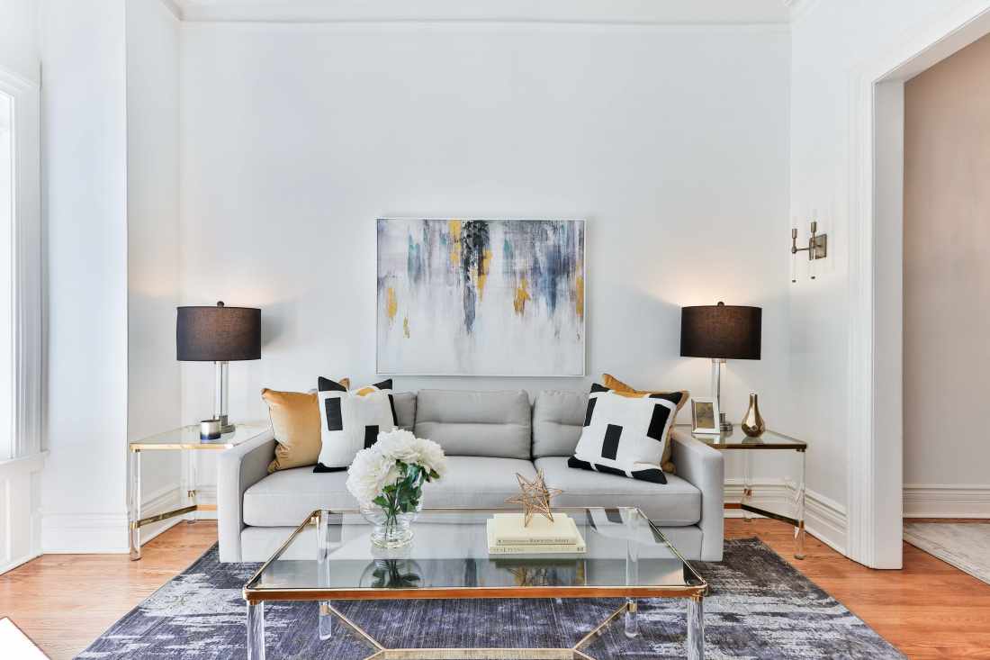
The painting completes the interior composition by repeating the color and patterns of the carpet.
3. Place
Who said that paintings are only hanging on the wall? Now they are placed on a shelf, table, or even the floor! More and more designers are using this technique for decorating a room: it looks stylish and the space on the walls remains free.
Paintings, especially graphics, may fade in direct sunlight. It is better to use additional lighting for them or come up with a place that the sun's rays are unlikely to reach.
Paintings, especially graphics, may fade in direct sunlight. It is better to use additional lighting for them or come up with a place that the sun's rays are unlikely to reach.
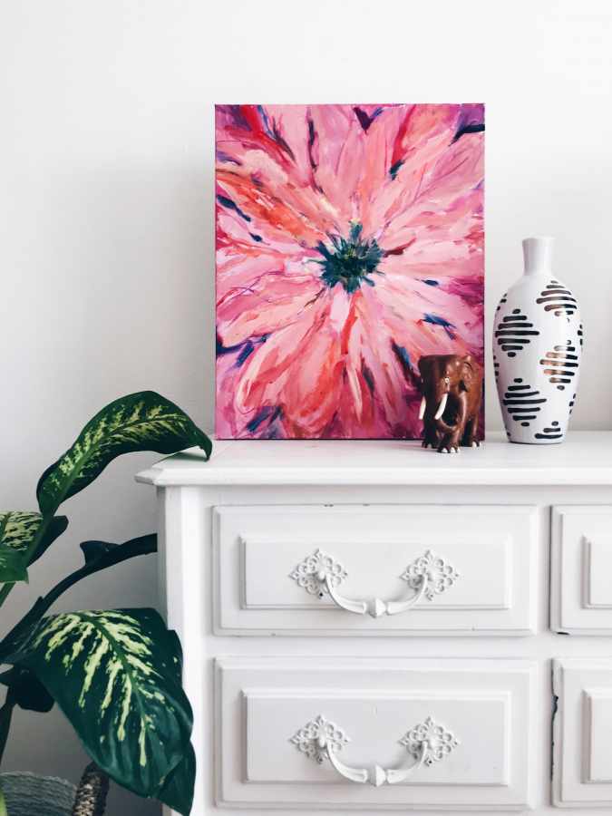
You can put figurines, vases, and other decorative elements nearby
4. Colour
It is not necessary to have a gray painting on the gray wall. Color matching is a whole science. Even incompatible, at first glance, shades can have a connection, if they are chosen correctly. Does the room have bright furniture? Let the canvas match its color. Are the walls green? The painting may have orange or red elements.
More combinations can be seen on Johannes Itten's color wheel. His diagram clearly shows which colors suit each other.
More combinations can be seen on Johannes Itten's color wheel. His diagram clearly shows which colors suit each other.
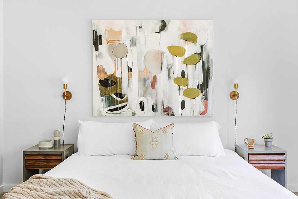
The colors of the bedside tables and lamps are repeated on the canvas, which becomes the "protagonist" of the bedroom
Wondering if your work will fit in with your space? In RakovGallery there is a "fitting" service: we deliver the painting to your home, and you have time to decide whether you want it or not.
5. Size
A little math is needed here. One rule always works with size: the width of the picture should be at least half the length of the furniture. Modular paintings should be chosen in a ratio of 2: 3 to the length of the furniture.
You can also resort to "optical illusions" of space. Vertical artwork, for example, will visually lengthen low ceilings.
The distance from the painting to the viewer should also be taken into account so that you and your guests could comfortably look at the canvas. This distance should be equal to twice the height of the painting.
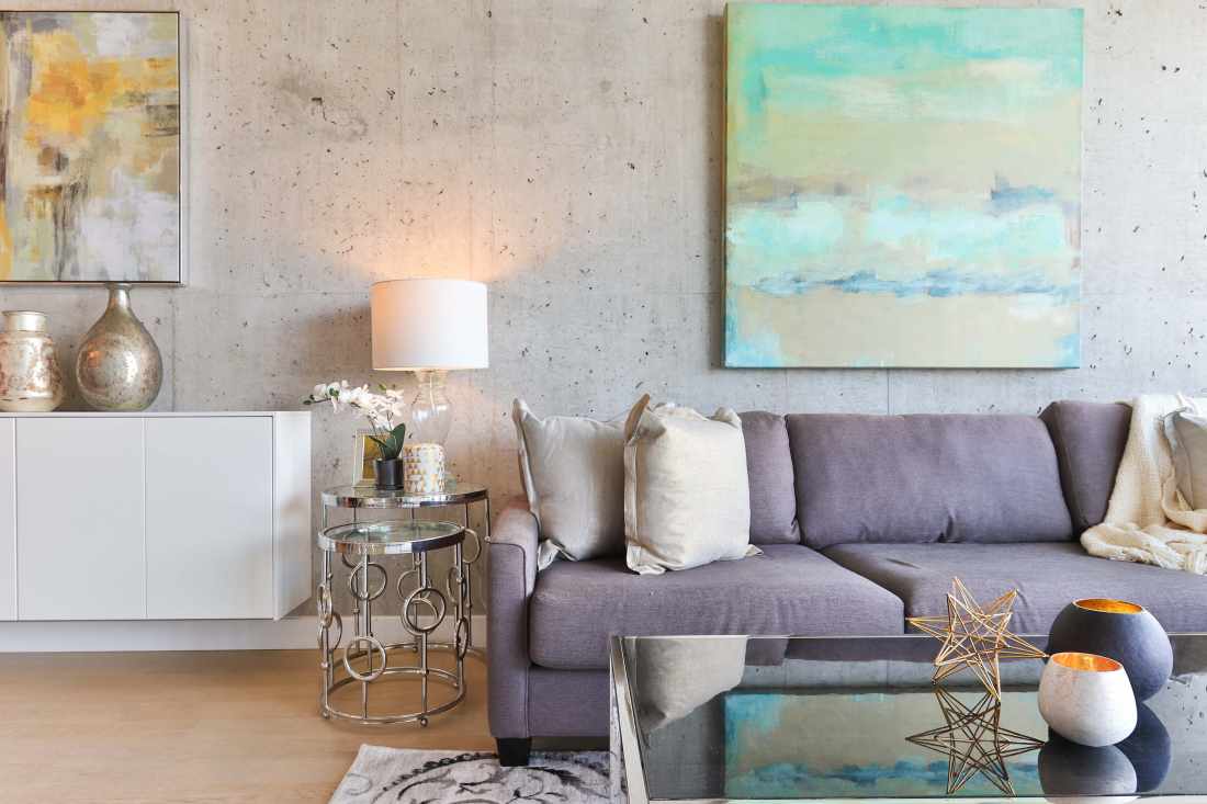
7. Frame
Imagine a situation: you fell in love with one artwork. You choose a frame for it, solemnly carry it home, and ... something is wrong. In most cases, this "wrong" lies in the wrong choice of frame.
The question can be solved in two ways. The first will work with contemporary art: it can do without a frame. The main thing is that the edges of the picture look well-groomed. The second way: take the canvas to a baguette workshop, where experts will suggest a good option and determine the required size with an accuracy of a millimeter. By the way, we select not only paintings but also frames: there is definitely a suitable one.
The question can be solved in two ways. The first will work with contemporary art: it can do without a frame. The main thing is that the edges of the picture look well-groomed. The second way: take the canvas to a baguette workshop, where experts will suggest a good option and determine the required size with an accuracy of a millimeter. By the way, we select not only paintings but also frames: there is definitely a suitable one.
